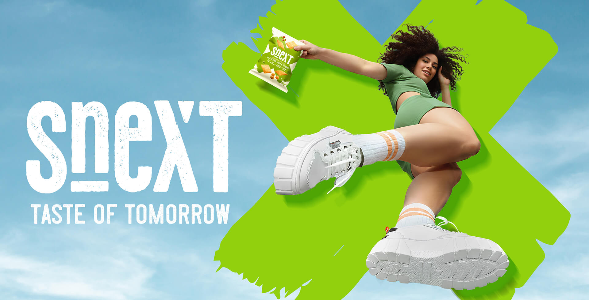
Snext: Gusta il Futuro
When Sama S.p.A. got us involved, the challenge was clear: to create a snack brand capable of
breaking the mould and projecting itself into the future. That is how Snext — the next snack — was born, a
name that combines innovation and taste in one powerful, immediate word.
We explored the creative territory to define a clear identity: well-being and flavour,
together, in a snack designed for those seeking balance without compromise. The result? A young, dynamic and conscious positioning, perfectly summed up in the payoff:
“Gusta il futuro / Taste of tomorrow”.
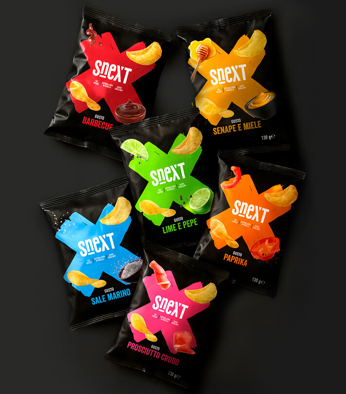
The visual heart of the brand is the coloured X: a distinctive graphic mark that recalls the heart of the
name and at the same time becomes a storytelling tool. Every product has its own X, every flavour
a nuance, every pack a personality.
Snext is divided into three lines designed to suit every palate:
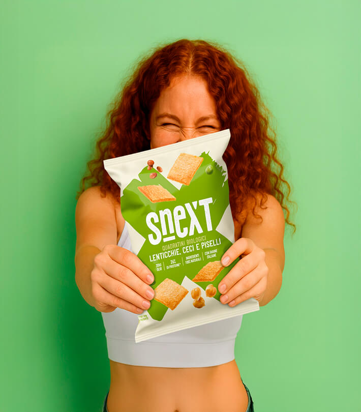
- Legume extrusions – the healthy heart, for those looking for a light yet nutritious snack.
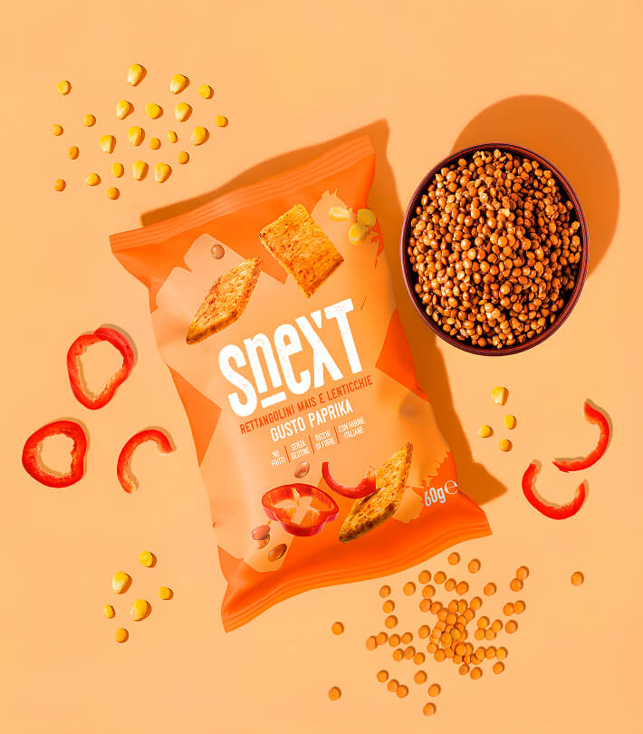
- Flavoured extrusions – such as paprika: for those who want a flavour twist without giving up well-being.
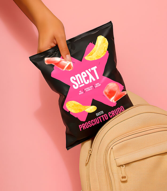
- Premium crisps – refined flavours, crunchy textures, gourmet appeal.
Snext is an explosive, young, conscious brand. A project we built
step by step, with the aim of launching not just a product, but a real experience.
The future can be savored. And it has a name: Snext.