
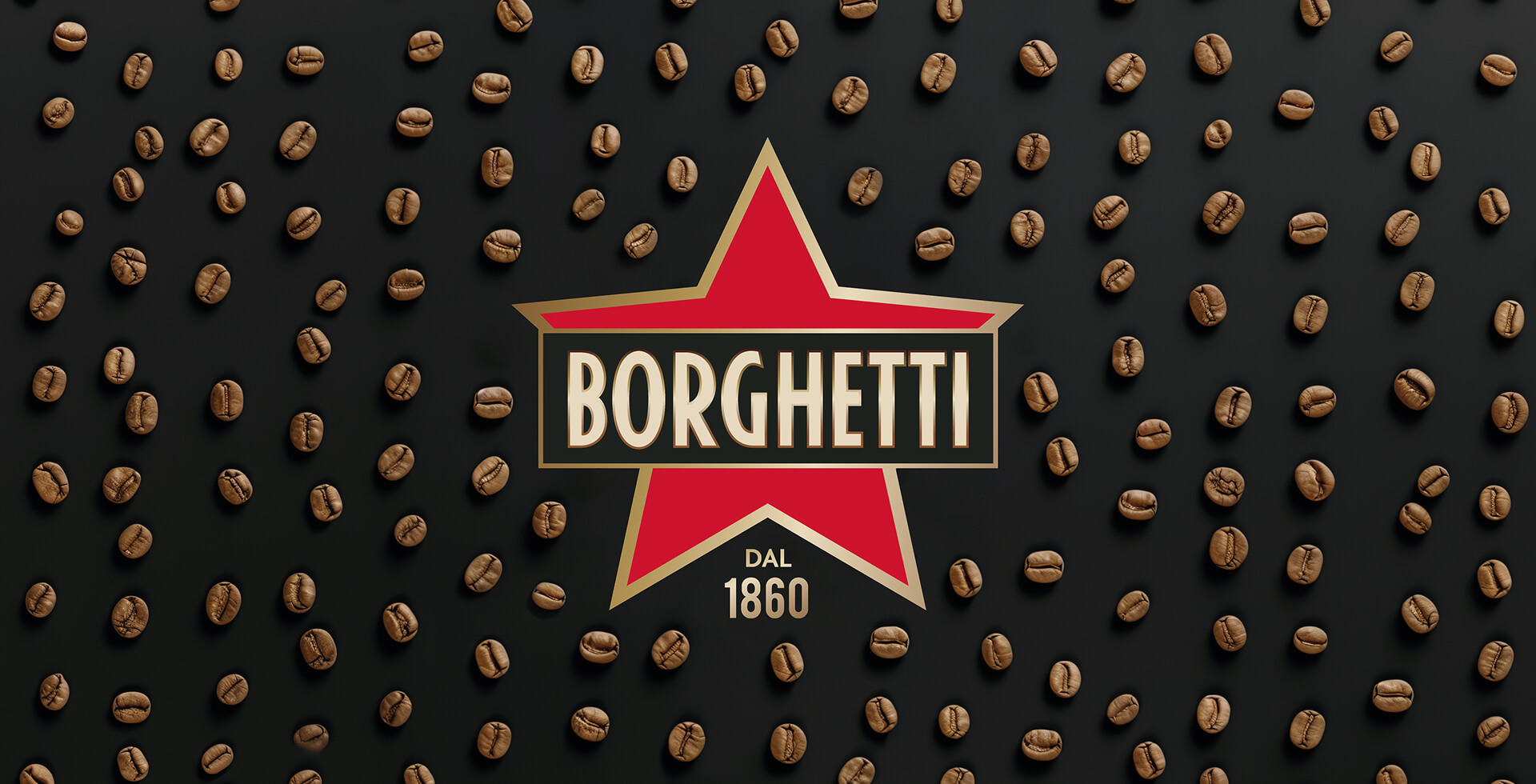
The Caffè Borghetti renewal project stems from the need to redefine the brand’s identity in a contemporary way, while preserving its strong historical recognisability. We started with a minimal restyling of the logo, aimed at simplifying its shapes and making it more current and versatile, leading to the definition of a new packaging system capable of expressing modernity, synthesis and clarity.
The goal was to enhance the product’s iconic status and premiumness, strengthening its positioning and its international perception. At the heart of the project we placed the brand’s most distinctive element: the goddess of coffee, reinterpreted and made the protagonist both on the pack and on the communication materials. The icon was simplified and ennobled, becoming a strong, recognisable identity mark, consistent across all touchpoints.
The new design, essential and elegant, was initially conceived for the US market, with the aim of making the product immediately readable and competitive on international shelves. The identity was then extended and adapted to the Italian market, maintaining visual and narrative consistency while enhancing local specificities and the brand’s heritage. The result is a contemporary and distinctive visual system, able to strengthen the premium value of Caffè Borghetti and consolidate its presence in different markets.


