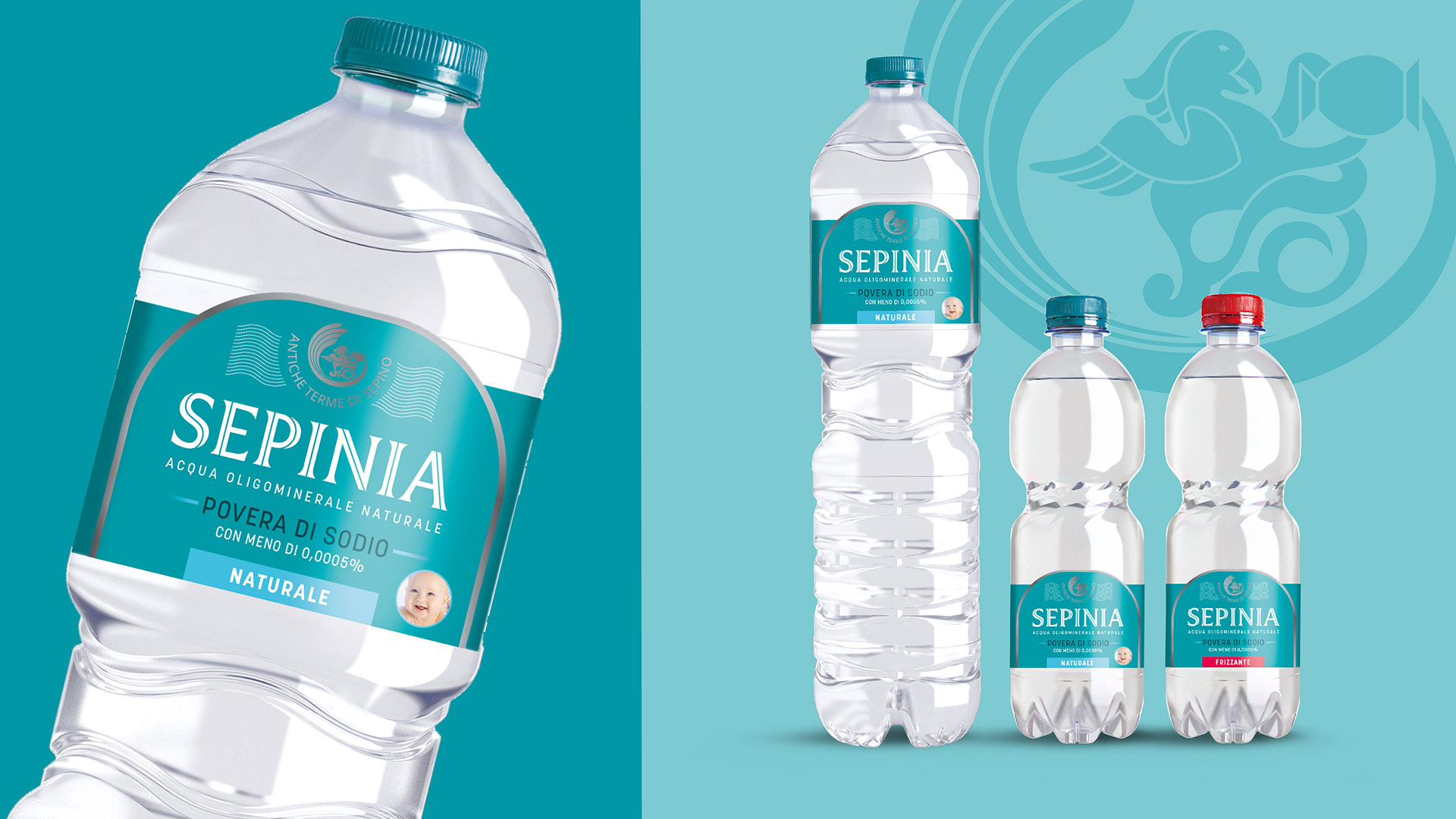
SEPINIA, l’acqua di chi vive leggero
From a land where nature is protected, silent and unspoilt, the Matese Apennines, comes Sepinia, a water with a thousand-year history.
A source of pure, balanced water, low in sodium.
For Sepinia, RBA Design created a new, modern image with a strong personality that recalls its historical origins while conveying the lightness and naturalness of the water. It starts from the symbols, the arch and the griffin, enhanced by silver finishes: elements that express a thousand-year history and a strong identity. The same identity emerges in the use of aqua green, which signals both the naturalness and the lightness of the brand. The logotype draws on tradition, evolving it for greater clarity and legibility.