
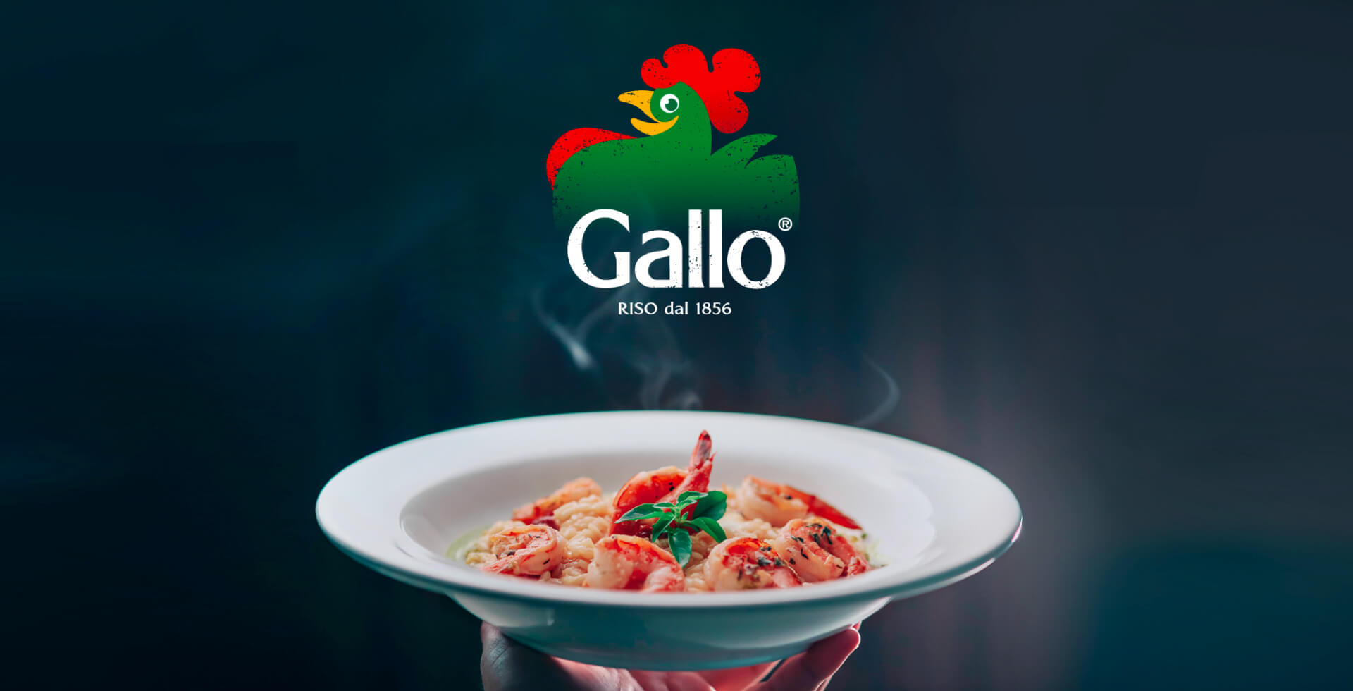
RISO GALLO BASMATI
BASMATI RICE: FLAVOUR, TRADITION AND WELL-BEING
Riso Gallo, described as a rice for the eyes, nose and mouth, has been part of Italians’ diet for six generations.
With the mission of spreading the culture of rice and risotto around the world, it is committed to creating only high-quality, practical and completely genuine products.
Among these, the famous Basmati rice, which in recent years has become a fixture of Italian eating habits. It stems from the need to pay greater attention to well-being and healthy eating, and it stars in many dishes such as salads, side dishes and poké.
From here, the need arose to create a brand positioning that would best leverage all the consumption opportunities related to rice itself. By rethinking the product’s offering, RBA Design worked on three new variants that expanded the range in question, emphasizing the differences of each while maintaining a common thread that spoke to all consumer households, through a targeted brand and packaging design project.
SUSTAINABLE QUALITY, DRESSED BY RBA DESIGN
Basmati Profumato, Integrale and Rosso&Nero. The first variant is designed for side dishes and light recipes. Its distinctive trait is an exotic touch, and it is the ideal product for lovers of the fragrance of classic Basmati. The colour palette, favouring blue, is decidedly authoritative and evokes classic imagery.
Basmati Integrale, on the other hand, was created to meet the needs of health-conscious consumers while still guaranteeing a rich, authentic taste. That is why the pack, with its illustrations, evokes healthy cooking and balanced recipes.
Finally, the Rosso&Nero variant is aimed at a younger target that follows the latest culinary trends: the rice is in fact suited to creative recipes such as poké. The same liveliness is at the heart of the design, with a brighter yellow and dynamic strokes that enhance the product’s characteristics.
The project as a whole gives great prominence to the Basmati name, but also to the specific variant. For the agency it was important to emphasise the quality of the product, highlighting its Himalayan origin: these are products linked to sustainable agriculture. Care for the environment is also behind the pack, which is eco-friendly and made of FSC-certified cardboard and recyclable plastic. These elements form part of the company’s all-round sustainability journey, known as “Il riso che sostiene”.
The key words are therefore authenticity and well-being, in a project that also makes the product easier to use: the packs clearly show information such as cooking time and the type of dish the product is best suited to.
The project further strengthens the Riso Gallo brand, responding concretely to the public’s needs through food design that is functional and tactile.
RISO GALLO CHIPS / SWEET SNACKS
A STORY OF WELL-BEING, SUCCESS AND CREATIVITY
Among the largest rice mills in Europe, Riso Gallo is a true culinary institution for Italians.
Starting from rice as an ingredient, the company has created a wide range of products, with lines for every taste and need, and above all versatile recipes that can be enriched in a personal and always creative way.
Speaking of creativity, in 2023 two new lines were launched: Riso Gallo Chips and Riso Gallo sweet snacks, the so-called Balls. Tempting, colourful, sweet and savoury products, for which RBA Design tailored a project able to communicate immediately the well-being provided by the key ingredient: rice. Without giving up the pleasure of treating yourself to a delicious snack at any time of day. These products reassure consumers about both their goodness and their balance, while new treats signed Riso Gallo are due to be released in the coming months.
THE FAMILY FEELING OF GALLO CHIPS AND SWEET BALLS
RBA Design’s interpretation of these innovative, tasty and healthy products is colourful and highly dynamic. The agency worked on the brand positioning, as well as the brand visual identity and packaging of the lines.
For the chips, the tactile colour palette uses light blue for the wholegrain rice chips with sea salt and red for the paprika-flavoured red rice chips.
The crunchy new products are presented through simple, explanatory symbols: the icons on the pack show that they are wholegrain, not fried, gluten-free and a source of fibre.
The project thus enhances a line containing less fat than typical crisps, while keeping flavour and character. What is communicated is, on the one hand, all the well-being of rice and, on the other, the indulgence of a snack. Both the tone of voice and the visuals aim to emphasise the completeness and liveliness of these chips, stimulating appetite appeal.
Turning to the project dedicated to the sweet balls, this is a line based on corn and rice: a light, pleasant snack suitable for any occasion. As with the chips, RBA Design once again placed great value on the balance between taste and well-being, creating an equally soft and above all cheerful design. The colours chosen were light blue for Cacao Rice milk flavour, brown for Cacao Rice dark and an intense pink for Rice with berries. These are the variants the creative team worked on, creating a handy pack with a distinctive personality. Here too, icons show that the pack can be recycled with paper, that the product is gluten-free and that it is made with wholegrain rice flour. Whether at the end of a meal or for a sweet break, Riso Gallo balls are the ideal choice for carefree pleasure that perfectly combines goodness and indulgence.
Both products are launched on the market to be consumed at different times and are characterized by a particularly cheerful, dynamic and impactful layout. They are therefore able to attract, through their contrasts, the attention of consumers on the sales shelves.
Little treats that bring with them all the lightness of Riso Gallo.


