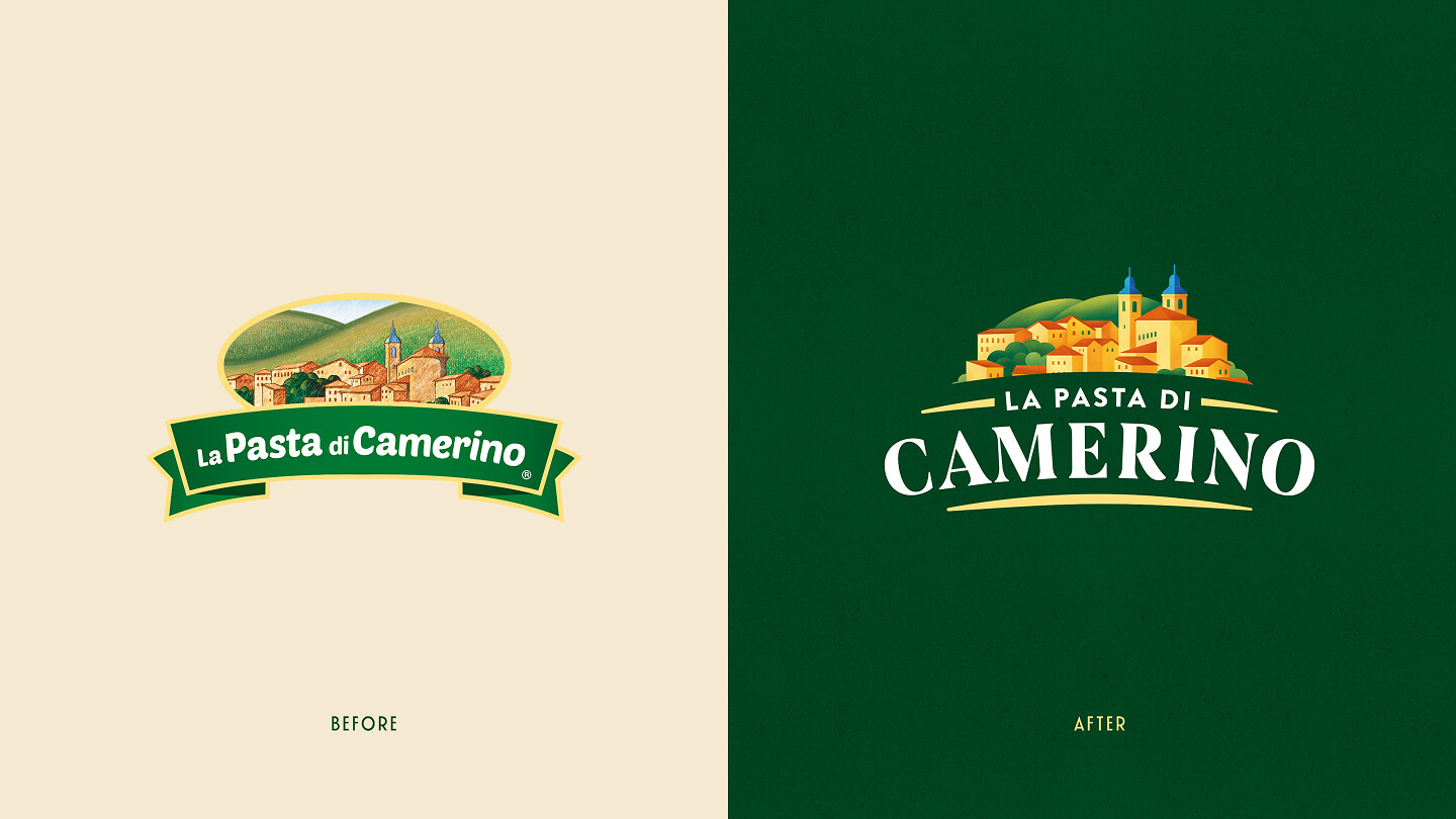
A restyling with a balanced, contemporary character, designed to renew the brand’s image while keeping its recognisability intact. The project stems from the need to accompany La Pasta di Camerino through a phase of natural evolution, enhancing its history and authenticity through a more current visual language that can still preserve and express the sincere flavour of a product that tastes of home, of healthy habits and of the expert hands of the Master Pasta Makers who produce it.
The project preserves the iconic elements, such as the distinctive colour and the illustration of Camerino, which evolves in a narrative key to tell the story of the territory and its tales, strengthening the bond with the place of origin: a fairy-tale village nestled among the hills of the Marche, where life flows slowly and conviviality is an inseparable value. This choice turns a historic symbol into a true brand asset: no longer mere decoration, but a graphic element capable of conveying identity, memory and a sense of belonging.
The new look & feel expresses authentic craftsmanship through a more contemporary visual language, capable of combining tradition and modernity. The clean composition, the more conscious use of spaces, and a clearer information hierarchy improve the product’s readability and premium perception. At the same time, the focus on materials, textures, and graphic details reinforces the idea of a brand that continues to grow without losing its cultural roots.
Presented at the recent TuttoFood edition, the restyling represented a key moment to show the public and industry players a renewed brand, more confident and ready to engage with an increasingly attentive consumer who values quality, transparency and the history of the products they choose, even at the table.