
A JOURNEY WITHIN THE JOURNEY. GRANDI STAZIONI RETAIL REINVENTS THE STATION.
Corporate identity project for Grandi Stazioni Retail, the new company that took over from FS in managing the commercial and advertising spaces of the 14 main Italian railway stations. A consortium formed by Antin Infrastructure, Borletti Group and Icamap: deep expertise in retail and real estate for an innovative project aimed at creating new shopping destinations, meeting places able to satisfy the needs of travellers, visitors and cities.
Among the first ambitious goals of the new company is to increase the average time spent in the station thanks to greater comfort, a renewed offer of shops and venues and therefore the creation of a valuable experience for users (the model and flagship already in operation is the new Mercato Centrale at Roma Termini).
RBA Design developed the strategic design platform and the coordinated brand image, from the creation of the logo to its application and the brand payoff.
The target audience is huge: a flow of travellers estimated at 750 million a year, spread across the whole country. A public mainly aged between 18 and 44, with above-average education and income and a decidedly high propensity to spend.
The concept interprets the station as a space that completes the journey, where people can live a unique experience and discover new opportunities. A great square where trains and people, products and events converge in an inclusive way, and where time takes on a new dimension, from relentless machinery to pleasure: a journey within the journey.
It is therefore not a matter of building the identity of individual real estate or media spaces to be rented or sold, but of developing a coherent, well-defined retail project capable of changing the perception of the station: from a simple place of transit to the space of a structured, widespread experience. A true Destination Brand.
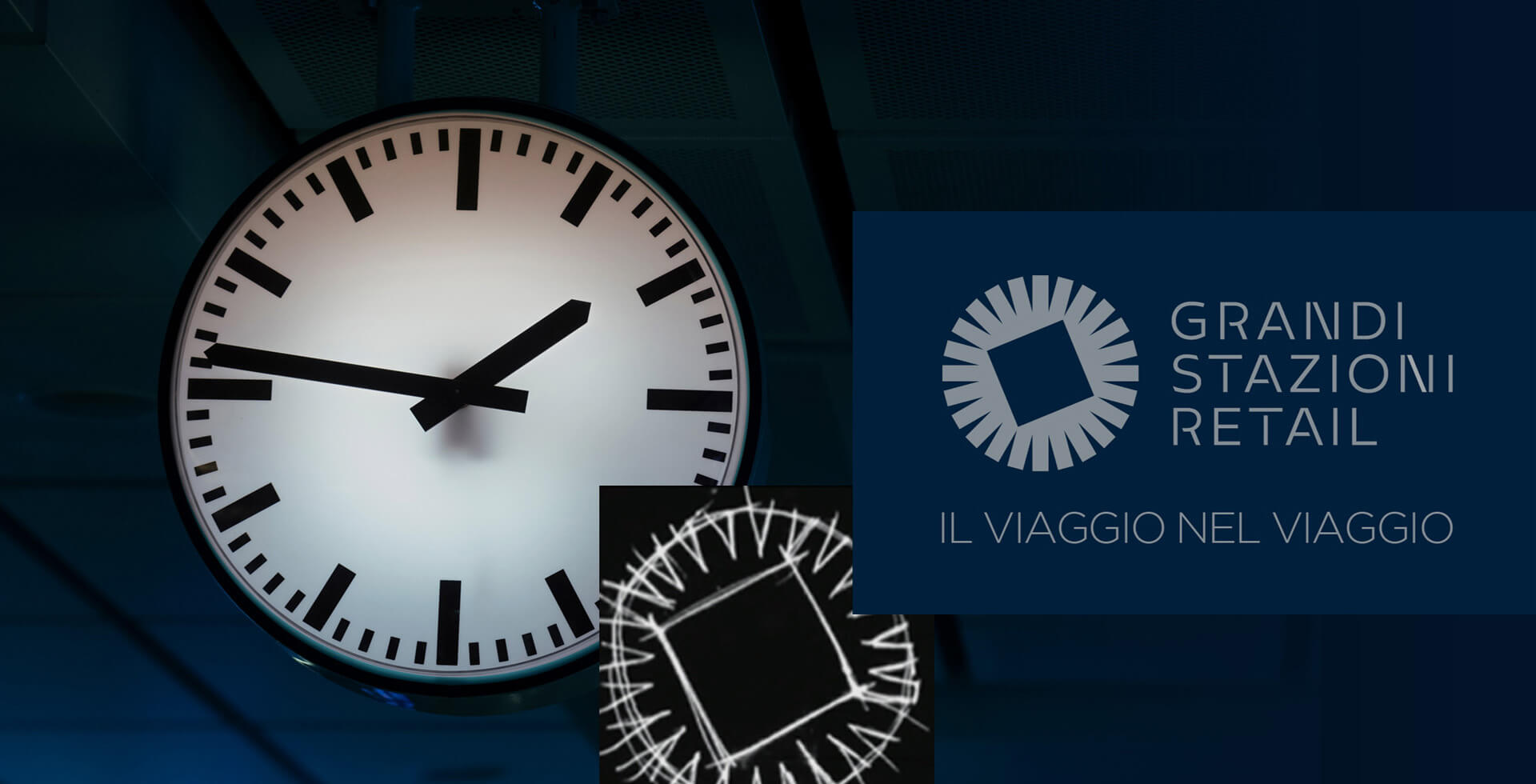
The new Grandi Stazioni Retail logo sums up the values of dynamism, modernity and value with a very strong, original mark that evokes the concept (the square at the centre of constantly moving flows), and an entirely redesigned typeface that adds a further touch of personality.


