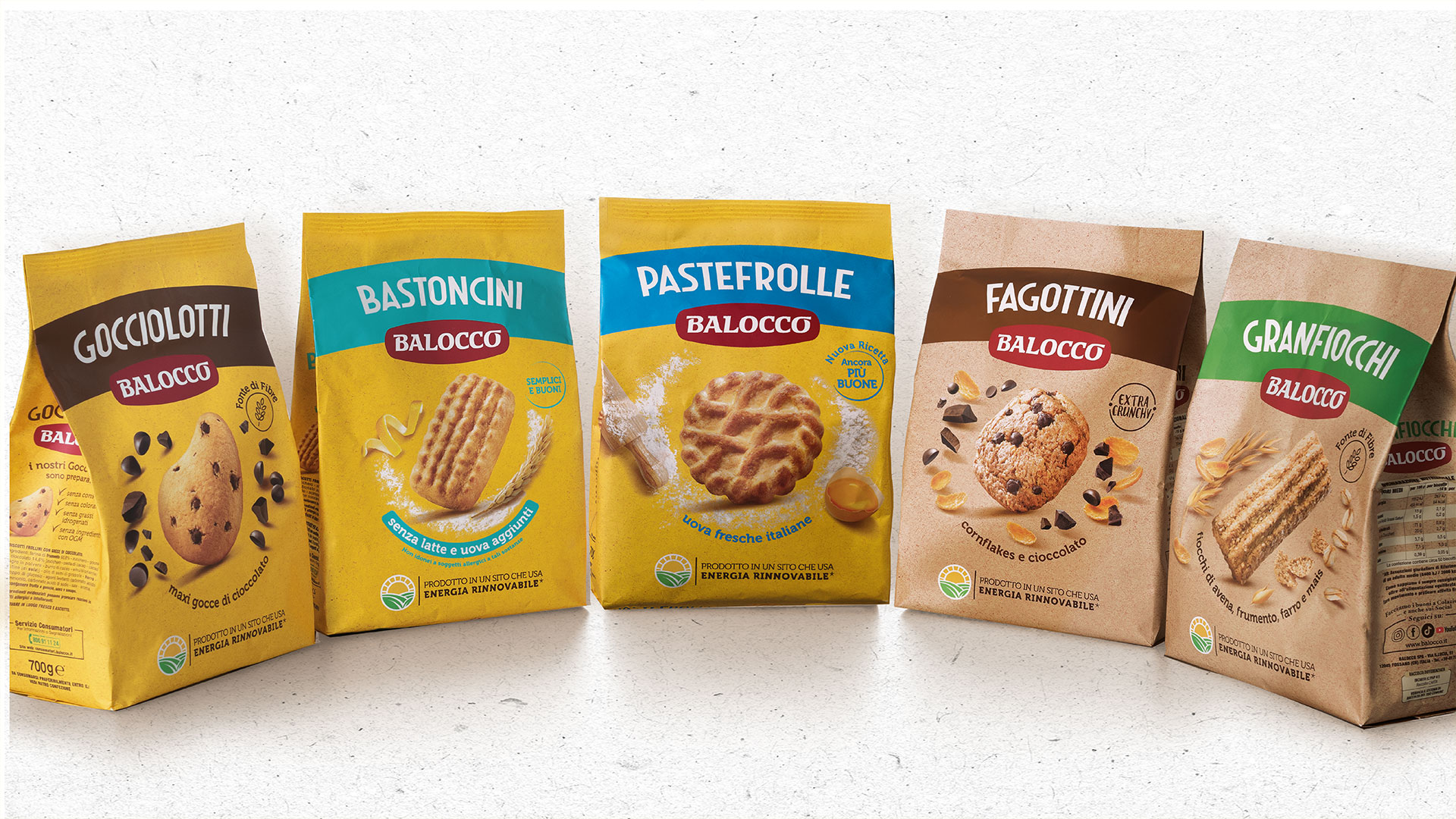

RBA Design developed the new identity of the Balocco Frollini line, presented at the latest edition of CIBUS in Parma. The restyling, which covers all 14 products in the Balocco range, puts the product centre stage, underlining the brand’s new positioning.
Immediacy, modernity, recognisability and storytelling are the words that define the new line. The agency worked on creating a strong identity that above all enhances the product, making it highly visible and the star at the centre of the pack, while also highlighting the ingredients. On the front of the pack, a coloured band carries the product name. The different colours once again emphasise the product type and ingredients (for example light blue for classic biscuits, brown for chocolate biscuits, green for wholegrain ones), improving the pack’s visibility on the shelf and making the consumer’s choice quicker.
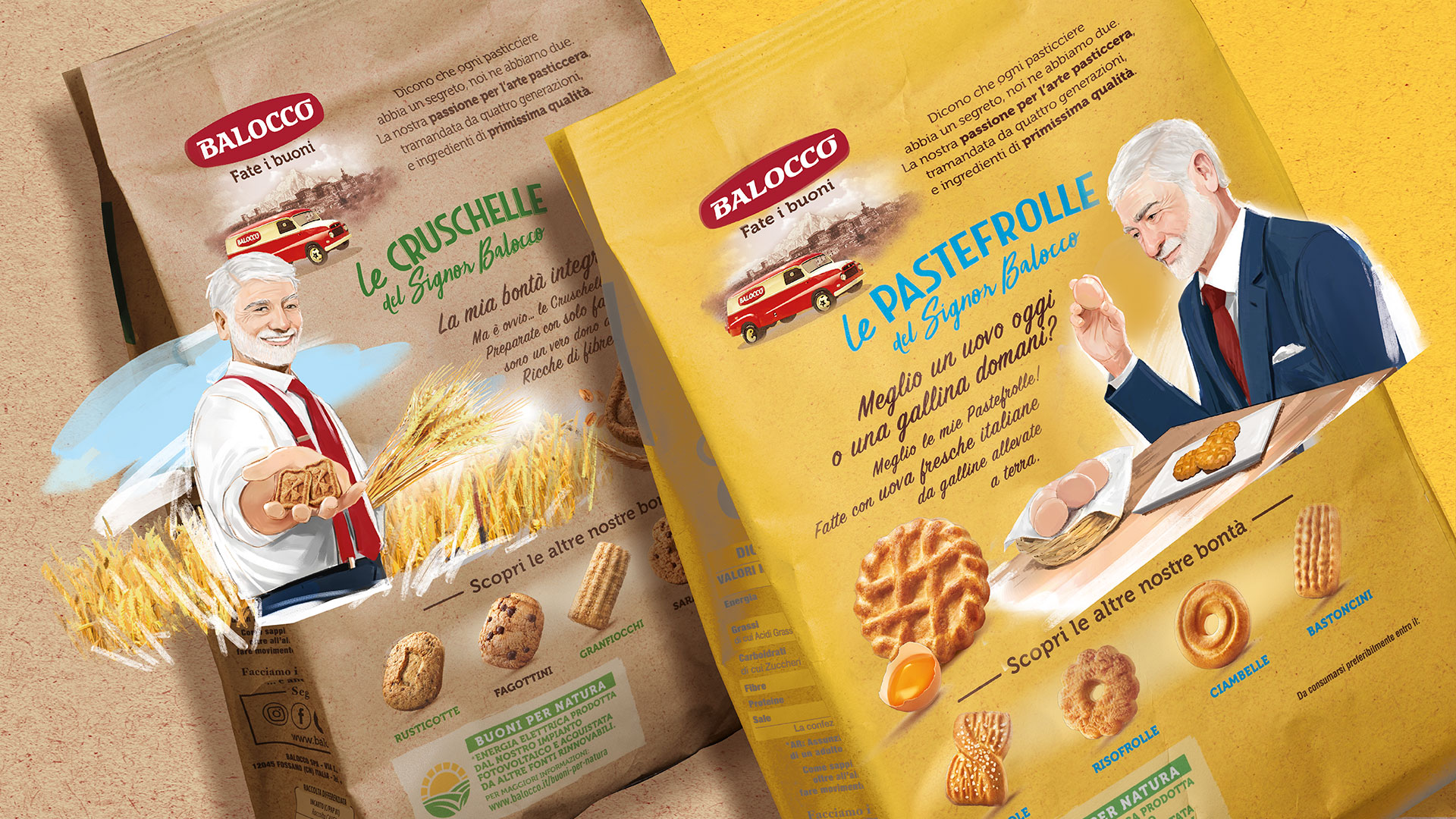
Completing the new packs is the ever-present Signor Balocco, featured on the back of every pack to tell, in a friendly way, the plus points of each product: a tip, a serving suggestion or an ingredient highlight. A story that starts on the front of the pack and continues on the back, in an ongoing narrative of the company. In this way the brand storytelling, with Signor Balocco as its undisputed protagonist, continues on the Frollini line too.