
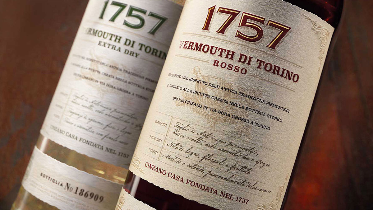
The story of a territory is told through the label placed on the bottle.
The evolution of wine design, a story made up of many elements that create the brand.
Lately, when we taste a glass of wine, we ask ourselves what its story is. This is thanks to the evolution and extraordinary communication activities that consortiums, fairs and producers have managed to carry out to protect and promote Made in Italy in the world of wine. And this story can only be told through the packaging, that is, the bottle that contains the wine, but even more so through the label that surrounds it.
Looking at the shelves of a supermarket, the shelves of a wine shop, or the cellars of restaurants, we can notice a proliferation of labels that feature different characters, colors, and formats. But what is the strategy for communicating a wine in the best possible way and for creating corporate branding for a wine house?
Wine design is based on solid principles that are essential for building the narrative of a product: authenticity, respect, accuracy and recognition. These elements allow for the creation of a brand ecosystem, even through a simple label, which must be not only beautiful to look at but also effective in communicating what the company has chosen to tell about itself. In fact, we know that in the world of wine 65% of consumers choose a product based on the label. This is a significant percentage and makes Label Design an extremely important commercial lever.
The label on the bottle then becomes the interpreter of that narrative that the winery will build together with the brand design agency, with the aim of defining in the best possible way all the elements that need to quickly, effectively and immediately speak about the territory, the production method, the grape variety and its characteristics. And they must speak to both the most experienced consumer and the one who for the first time enters the world of wine. Convincing them and getting them to buy.
In the vast wine cellar that the consumer has before their eyes, it will be the bottle that is able to tell a story that will prevail and be chosen Cinzano. It is essential that the story be AUTHENTIC, that it really traces the steps taken by the company. A story that is able to tell the past, the present and with a future vision. This is the case of the rebranding work carried out for (https://www.rbadesign.it/news/made-for-italy-il-patrimonio-dellitalianita/). A heritage, a history that began in 1757, but that is still able, thanks to careful research work, to bring the story to life and to move even a young consumer.
Telling a brand’s story is not an easy task; you need to know how to capture its essence, its brand identity, and present it with the values that are now considered prestigious: simplicity, clarity, and transparency. These values become even more important in the small space dedicated to those who work in label design and wine design. In particular, in the world of wine, clarity becomes a fundamental factor: from the naming choice to the design. Few words are enough to tell a story about a territory, an experience, and the history of a company. Therefore, extreme cleanliness is necessary when choosing the elements to be included on the label: from the lettering to the colors. And we return to the case study Cinzano, which takes a story from the past while maintaining the unmistakable red and blue colors that are distinctive of the company.
Another important element in creating packaging for the Wine&Spirits world is UNICITA’, made up of many elements, including the accuracy of the details. One name stands out above all others: Aperol (https://www.rbadesign.it/work/aperol/) . A brand that alone is synonymous with aperitivo. But what makes it so unique? The design, but above all the color. That orange that, wherever it is placed – on a bottle, a bar sign, a terrace – immediately brings to mind that bottle, that label. In a blend of visual and verbal elements that can also change over time, being flexible, without ever losing their recognizability.
The brand always lives where people live, which is why it must be able to evolve Averna. The history of the rebranding of (https://www.rbadesign.it/work/averna/), a historic brand in the spirits world, starts from this premise: to remain alive in people’s minds, but at the same time to remain always current. The work of the corporate branding agency is in this case precisely to accompany the company on this journey. The story begins from the territory, simply recovering all those elements that have been mentioned so far. WITH RESPECT to a lived experience, a journey that should never be forgotten in order to remain credible in the eyes of the consumer. The same respect for the land that Fattoria La Maliosa (https://www.rbadesign.it/news/rba-design-vince-con-fattoria-la-maliosa-a-pentawards/) did just that, until it became a full-voice narrative about the label, which clearly conveys the production instructions of a Method, the Corino® Method. The value of this narrative has now become a winning element of the wine design project.